Case study
Creating a new brand identity for Protagen Diagnostics
Download PDF

The Challenge
Prior to approaching our team, Protagen AG had recently divested its protein services division to refocus its strategy on diagnostic development. As such, it was looking to rebrand its existing business to position the new company as a dedicated developer of diagnostics, with an innovative and energetic identity that better reflected the current and future position of the company and its dedicated team. Protagen required the new brand to communicate strength, reliability and credibility to its three main target audiences:- Pharmaceutical companies (companion diagnostic (CDx) development)
- Clinicians and diagnostic laboratories (diagnostic (Dx) test products)
- Investors for ongoing funding rounds
It was also important to consider messaging for patients, as those interested in their disease might end up on the Protagen website and could later become an influential voice driving doctors and diagnostics labs to use Protagen diagnostic tests.
The Solution: The importance of market positioning
Positioning is the space that a company occupies in the minds of customers and prospects. It is a crucial ingredient in the buying process and should never be left to chance. It’s a powerful opportunity to highlight the value that only you can deliver.
Positioning:
- Defines how a company is seen in comparison to other options prospects may consider
- States clearly the ideal meaning and value offered by your company
- Forms the foundation for all communications efforts going forward
- Provides a launch point and guide for creative development
Positioning is not customer facing language. It’s simply the idea or thought we want to embed with the market. Successful product positioning strategies should differentiate a product by focusing on unique selling points, address important customer challenges, needs and buying criteria, and articulate key product benefits and attributes in engaging language.
To achieve these objectives for Protagen, we needed to gain an understanding of:
- The challenges experienced by its target markets
- How these people make purchasing decisions, and based on what needs and values
- How its competition positions their products to meet these needs
- What its company, technology and products had to offer that would differentiate it in the marketplace
The Strategy: Initial market research & brand audit
Essential to establishing the unique value proposition and new position for Protagen was the collation of market research data to evaluate the current diagnostic need, market opportunity, brand perception and competitor context. This was conducted via in-depth interviews (IDIs) with existing staff members, customers, Pharma partners, key opinion leaders (KOLs), prospects and diagnostic providers across the USA and Europe, covering key disciplines and disease indications.
Competitor websites, sales materials and communication programmes were also analysed, in order to establish positioning, messaging and a visual direction that would allow Protagen to ‘own’ a space in the market.
The resulting qualitative and quantitative data from internal and external sources were analysed to deliver a full report and presentation outlining the optimal market position for Protagen. This directional guidance aided subsequent message, creative and content development.
.png)
The Strategy: Messaging & brand platform development
From the research and analysis conducted, the aim was to identify a compelling market position for Protagen that was:
- Unique
- Meaningful
- Credible
- Ownable
Using the data collected, our senior strategy team carefully crafted positioning statements with supportive context to build a picture of the company today and tomorrow, outlining its key attributes, personality and core brand values.
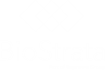
The results of this process were initially delivered via our ‘brand platform’ document, which captured the essence of Protagen on a single page. This document helps align all stakeholders and ensures everyone is communicating the same core messages about the brand.
Execution: Logo design
Our team concepted creative ideas for a new visual identity that would represent the new brand and integrate some iconography that would fit harmoniously with the core messages and values developed. Numerous iterations were concepted as part of this process, with the first stage worked up in black and white to avoid colour bias. After the preferred logo was chosen, different colour palettes were applied, before the final version was selected. At each step we referred back to our market research and competitor positioning to ensure the new logo would help Protagen stand out from rest of the market.
The result was a clean, strong logo using warm and approachable colours. The font is very soft and modern – not rigid, strong and corporate – to depict Protagen as a strong but friendly, open and collaborative company, an important message for its partnering position with Pharma. The interwoven PD icon represents both parts of the Protagen business, as both Dx and CDx are connected and the pathways of discovery are intertwining. The PD part of the logo can also be used in isolation and applied to future product packaging development and branding.
The deliverables included:
- New colour palette – including a dynamic set of clear, impactful primary and secondary colours
- Comprehensive style guide document for correct logo and icon use, to ensure consistency across all brand materials
Execution: Visual identity
![]()
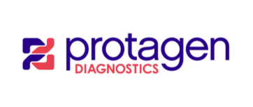
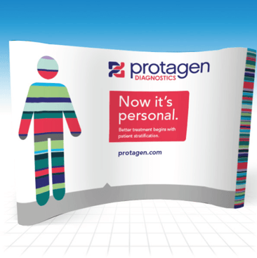
As part of the creative development process we wanted to create a visual device that was impactful, unique and embodied the ‘better patient stratification’ message (a need cited by both Pharma customers and doctors looking to more effectively treat patients).
This was important, as creating a concept that provided longevity and breadth of use across the different pharma and clinical audiences (including patients) was a key requirement. Utilising a concept that could later be animated and adapted to signify each disease indication would also be of benefit. The final design:
- Took the form of a custom designed ‘stratified man’ element
- This emphasises the:
- Personal approach that Protagen takes to autoimmune diagnostic development
- Personalised medicine application of the diagnostic technology
- The coloured bars represent stratification
- There is also the suggestion that this forms a bar code, allowing patients to be accurately classified
- The new design was created to seamlessly integrate with the website template and other collateral designs
Execution: Application of visual concepts
The new branding, visual identity and creative devices were applied to sales and marketing materials including advertisements, website pages and sales collateral.
.png)
Execution: Letterheads and stationary
A full portfolio of stationary materials including letterheads, business cards, complement slips, tech sheets, white paper templates and application note templates were developed and provided as digital files and printed (where required). Our team also sourced and supplied a collection of branded giveaways such as pens, mugs and bags that were presented to staff at the rebrand launch.
.png)
Execution: Sales collateral development
To support the Protagen team and continue with the application of the new positioning, messaging and graphical work up, our integrated team of designers and copywriters applied their skills to craft engaging, informative copy across key sales presentations for both investor and pharmaceutical prospects. We redrew old graphics and existing data charts to align with the new brand guidelines and applied new image stock photography where required.
.png)
Execution: Full website production
After developing an initial wireframe and navigational structure, our team of experts carefully designed web page templates, sourced imagery and crafted technical and commercial content to resonate with the clinical, pharma and investor target audiences.
We also started to put in place sections of the sites that would use ‘patient-friendly’ language, ready for later use.
Execution: Exhibition booth graphics
The new design and colour palettes were also applied to exhibition graphics for production. Pull up roller banners and template 10x10 booth graphics were delivered to the client.

Next steps: Communication outreach to launch the new brand
Having established the brand identity and core messaging for Protagen through sales collateral including a new website, the next steps include introducing the ‘new’ Protagen more proactively to the market through a variety of marketing tactics. BioStrata was retained to provide a significant level of support with this activity, from ongoing creative work to copy development, video production and digital support. Although not covered in detail here, this included:
- Whitepaper development
- Infographic creation
- A trade PR program to reach medical and pharma audiences
- A corporate PR program to attract interest of the investor community
- Media training and bio development for key spokespeople
- Media outreach around key topics to secure interviews
- Collaborations with KOLs to create thought leader content (e.g. as articles, video interviews etc.)
- Event attendance, including abstract submissions for posters and talks and the provision of ‘on booth’ media meetings
- Promotion of key content via email and SEM/Google Ad campaigns
- Ad planning and booking, where appropriate
Get started on your branding project
We can help you with branding your company, products or services. Get in touch with our team to get started today.